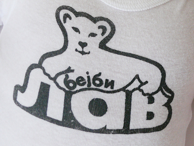
Started for my nephew and perfected when my son was born, this graphic plays on the word "lav", which in Serbian — my native tongue — means "lion", yet when pronounced sounds just like "love". Baby Lav therefore means both "lion cub" and "baby love". I printed it on onezies and thank you cards.
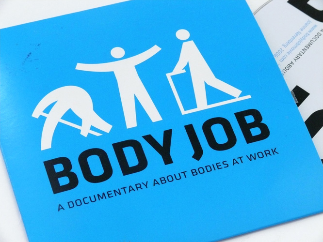
Icons depicting the utility of our bodies were the basis for this DVD package of director Joanne Nerenberg's documentary about the physical nature of work.
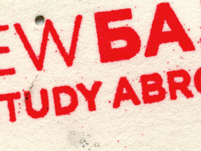
We proposed a study abroad program in the Balkans in which students would explore how newly-formed states in this European region expressed themselves through graphic design.
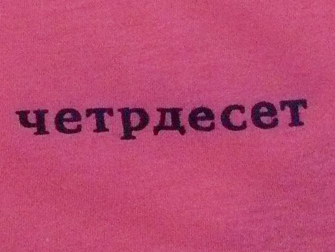
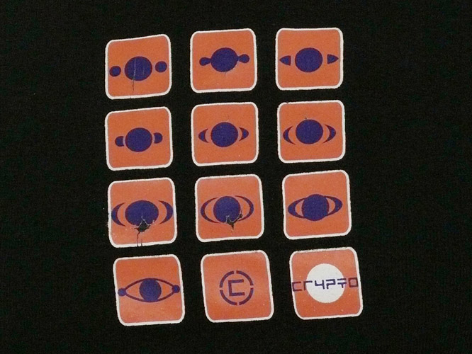
The Serbian word for "forty" (che-tr-deh-set) is set in forty-point type and kerned forty points on this shirt for all those approaching this milestone.
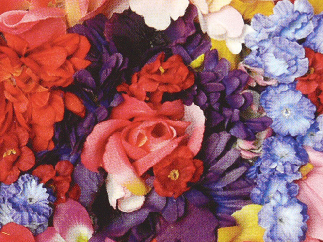
We delighted in the cheap decadence of fake flowers to create this invitation to an exhibition at the 2219 Gallery in Baltimore.
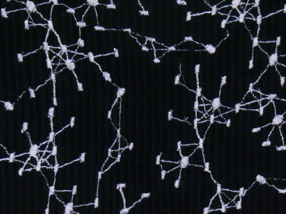
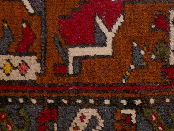
Scientific diagrams charting protein-protein interactions are digitaly embroidered onto place mats. They become metaphors for off-line social networking that happens around the dinner table.
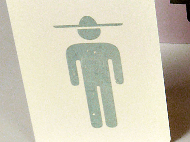
I made this series of generic pictograms altered to depict specific nationalities, and printed them on greeting cards and t-shirts.

For my own wedding invite, I dug deep into cultural references and memories to make vectors that described us both; A gatefold allowed for a bilingual layout.
To reflect the diversity within this designers' collective, I used real wood, canvas and paper to design two invitations for its sales event.

A brochure for the educational programs of the Audubon Center in Brooklyn's Prospect Park.
Made to mimic a blank television screen, this throw pillow reflects our over-consumption of mass media.
Rasterized birds fly across the plane of this business card for a travel-savvy photographer and designer.
A gift set of greeting cards featuring long exposure photographs from a Russian Orthodox church in New York. Commisioned by the OCA Cathedral, Protection of the Holy Virgin, New York.
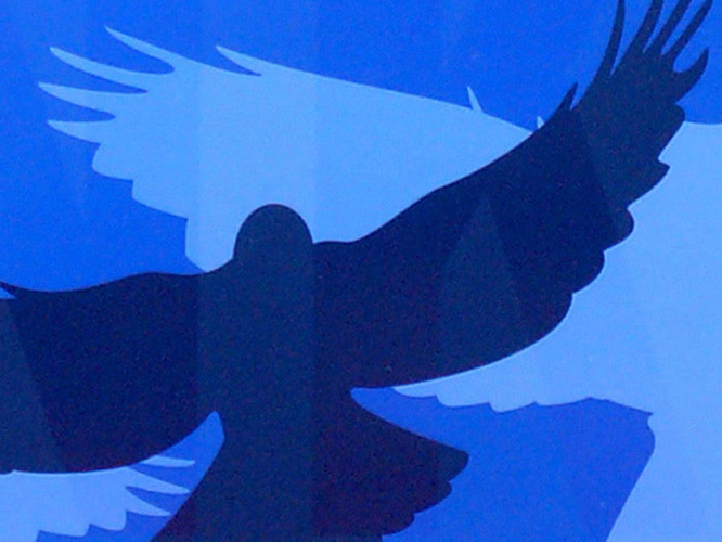
Winged illustrations, a palette of blues and spot varnish set the tone for this Edgar-Allan-Poe-themed annual fundraiser of the AIGA Baltimore Chapter.
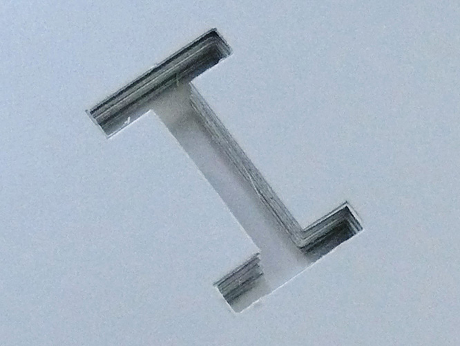
For the identity of I-Beam, a New York architecture studio, I cut the logo out of the metallic business card to emphasize the materiality of the profession. A functional scale running across the top turns the card into a design tool.
I did this curvy lettering for the "Best in Show" award for the graphic design class of 2012 commencement show at MICA. Award design by Keetra Dean Dixon.
Helen and I designed these interactive coasters as a complement to our 2011 book, Participate: Designing with User-Generated Content . They feature the four big concepts from our book and invite users to draw on them and interlock them to build structures.
Exhibition graphics for the new toddler area at the Port Discovery Children's Museum in Baltimore, Maryland. For this project, I worked with the esteemed exhibition design firm, Argyle Design.
In spring 2019, I worked with prof Inna Alesina to produce Word Build, a participatory typography installation at Stevenson University in Baltimore. The project, supported by a Stevenson Arts Alive grant, tops off a year-long effort by Alesina to engage the campus community through workshops, questionnaires and public interventions. The content accrued throughout the year was then used as material by students to build monumental letters spelling the school’s name, currently on view at Stevenson’s KMAC building.
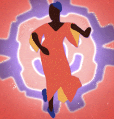
[*Click here to see the Dance Card web page.*](https://sites.google.com/mica.edu/hadassahcard2023/home/)
Pattern design: Hadassah Dowuona, MICA Fiber '20
Animation 1 by Tom Woronowicz, MICA Animation '24, based on pattern by Hadassah Dowuona
Animation 2 by MICA professor Isma Sanz-Pena, also based on Hadassah's pattern
Overall concept, card design and fabric printout by MICA professor and associate dean emeritus Zvezdana Stojmirovic. Also shown is a view of my office at MICA.
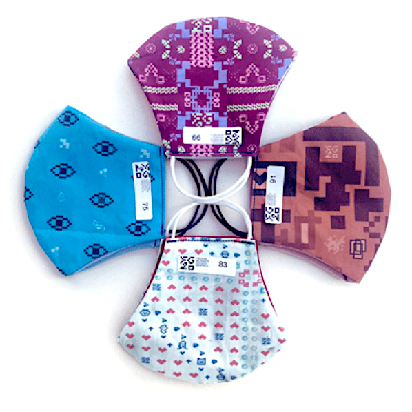
FG20 was a project in my Fashion Graphics at the time of the Covid19 pandemic. Students created original, one of a kind, custom-designed and special-printed fabrics from which they sewed face masks. The class offered them for sale and the entire project sold out.